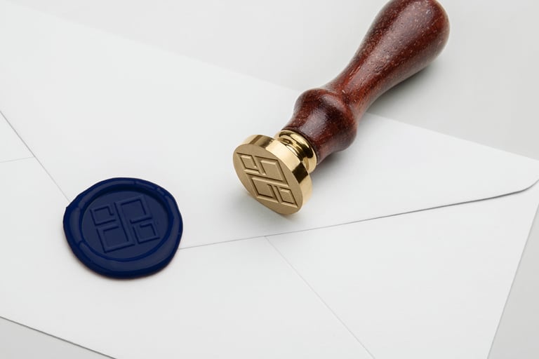
Rausch Advocacia
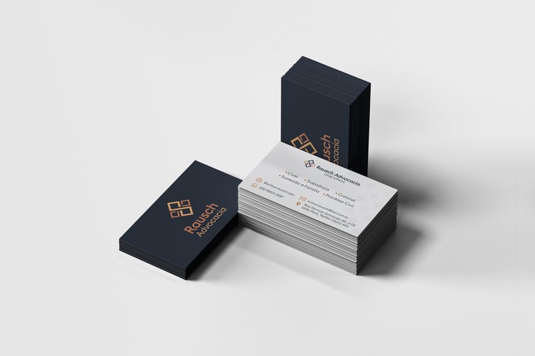
For Rausch Advocacia's visual identity, we had the challenge of searching traditional Law icons for a way to create a modern, simple and appropriate design.
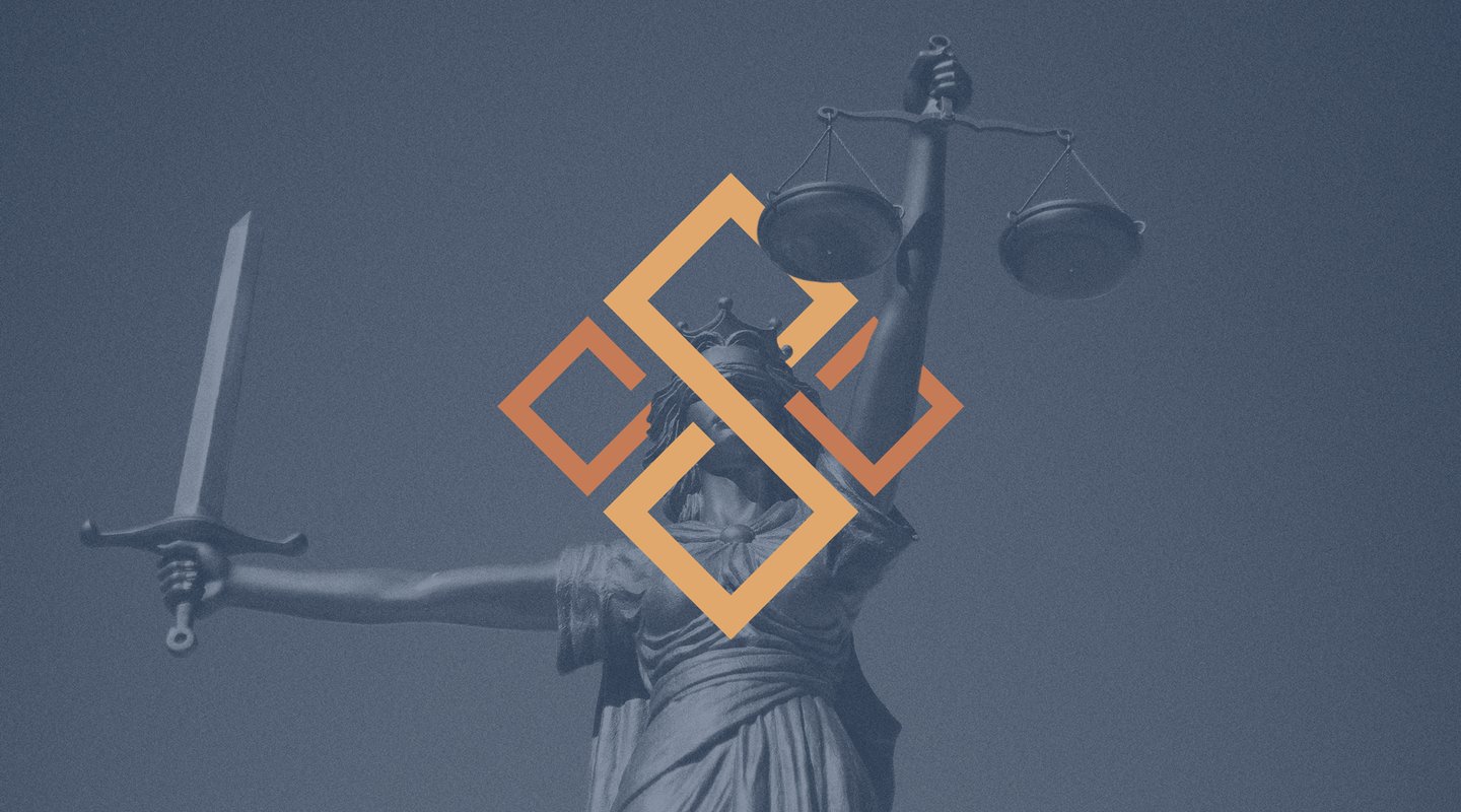
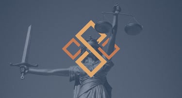
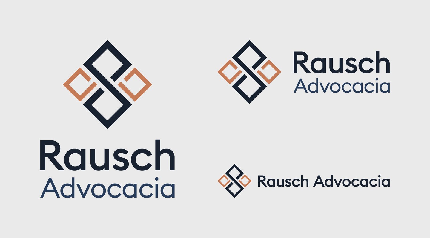
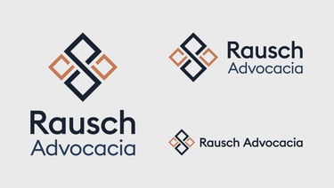
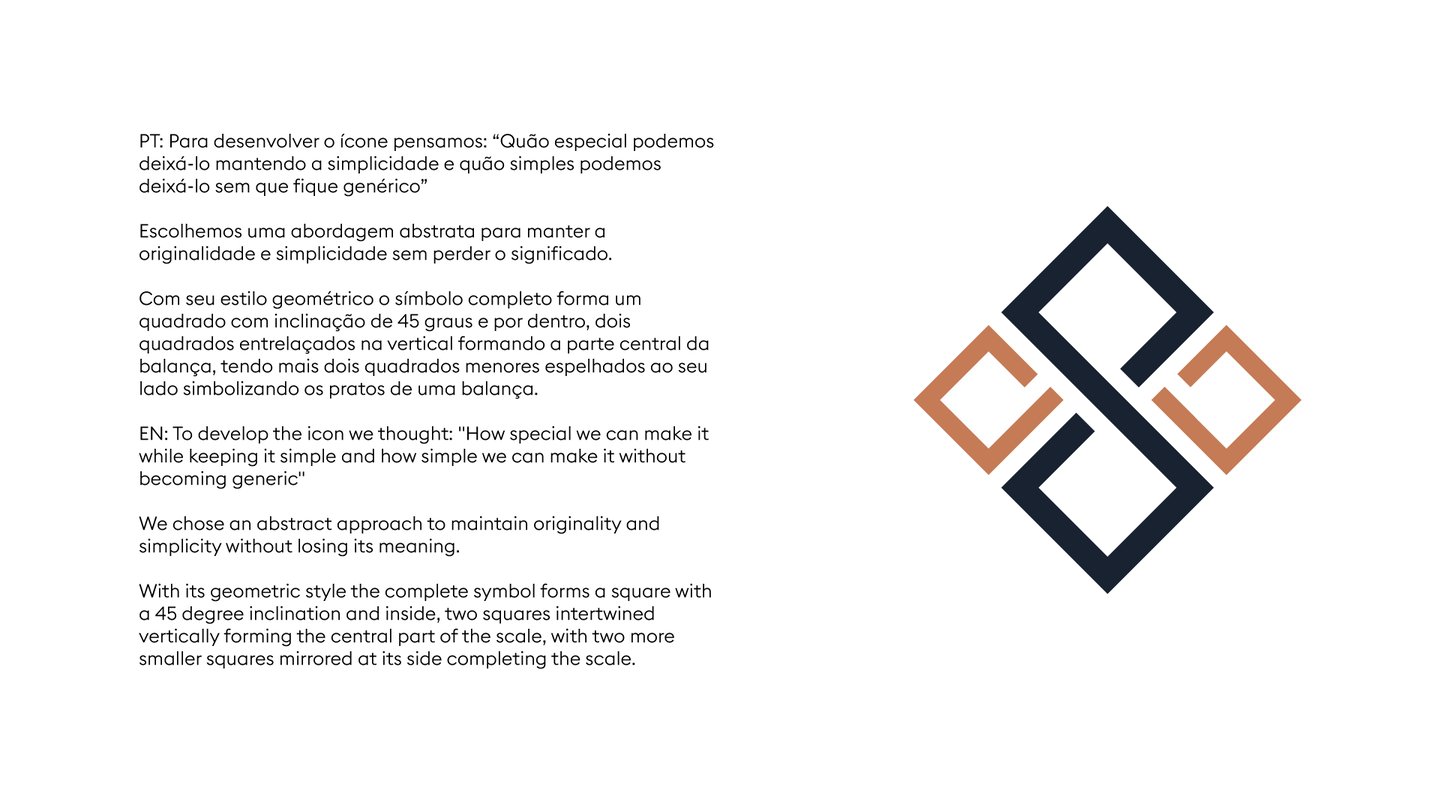
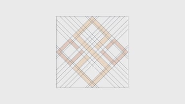
After a lot of research, we opted for the most famous symbol used to represent law, the scale.
We are looked for a way to keep the symbol from becoming generic, that would be unique and simple enough to work in various sizes and applications.
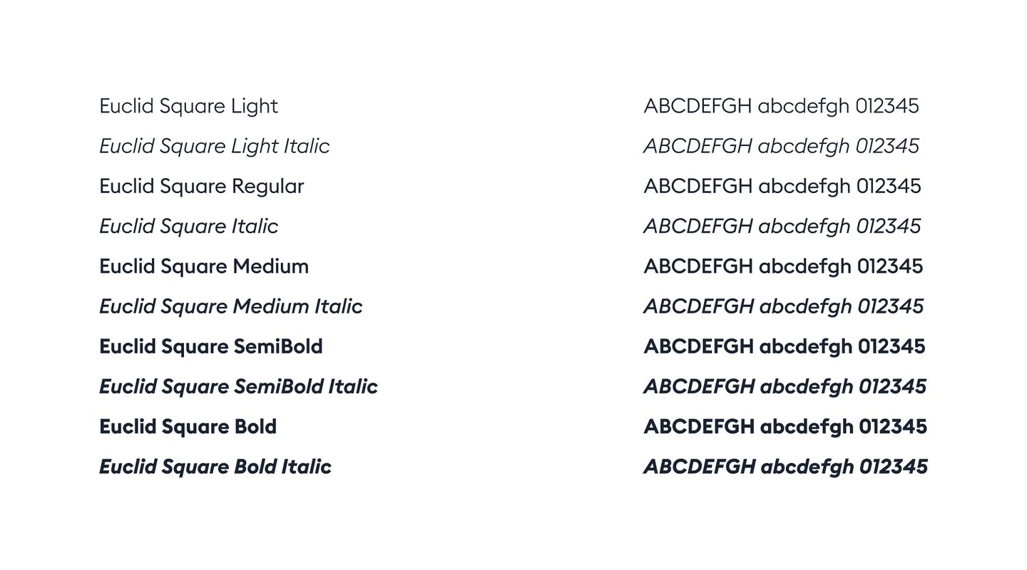
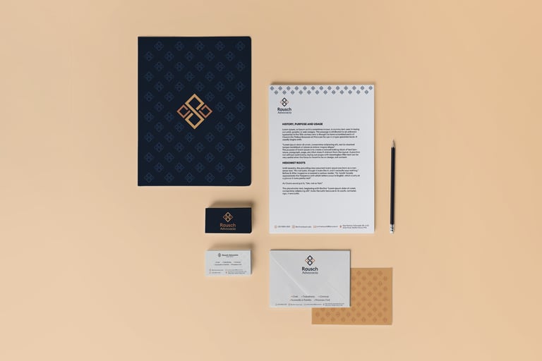
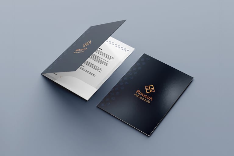
The choice of colours was designed to convey confidence, seriousness and knowledge, combined with a typography that manages to balance seriousness and modernity.
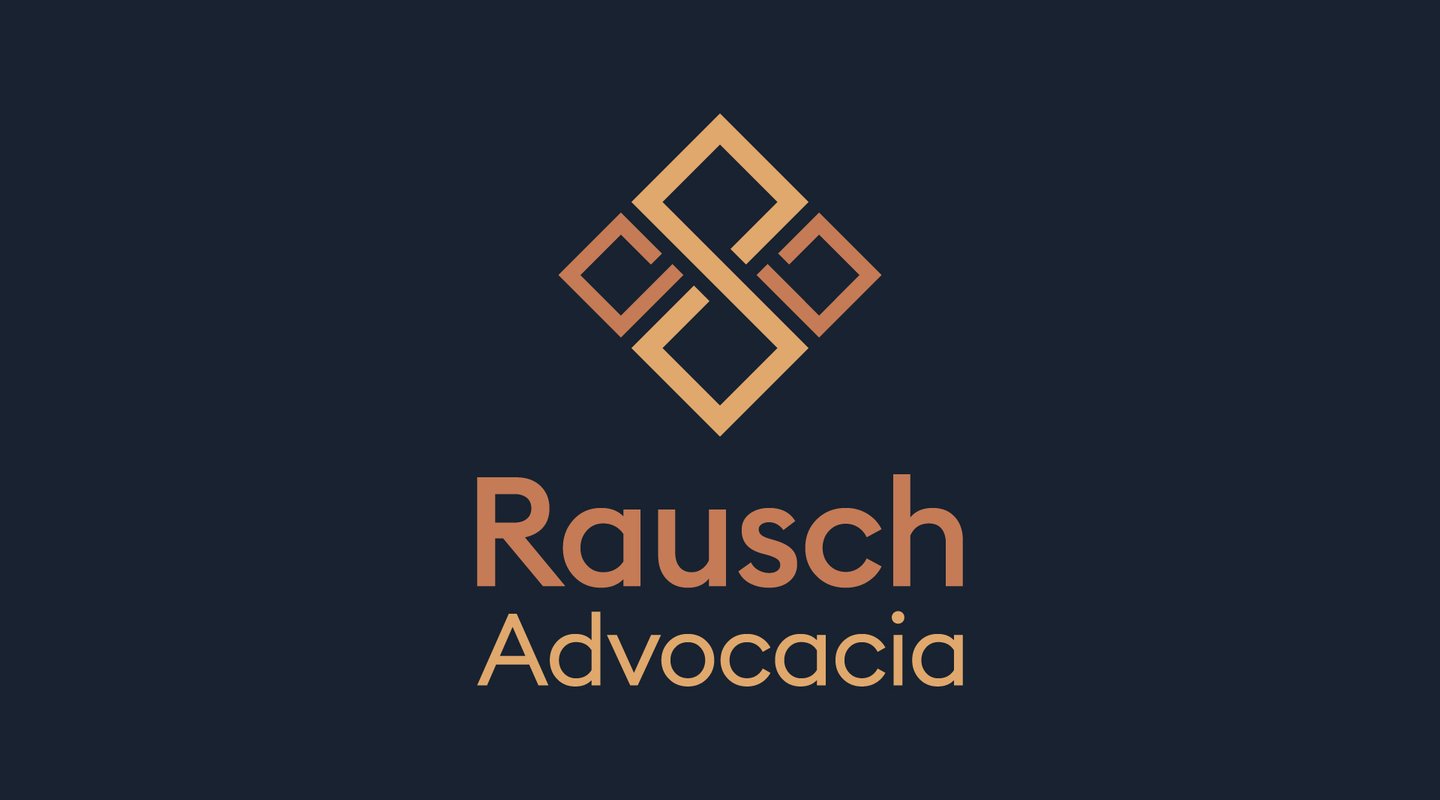


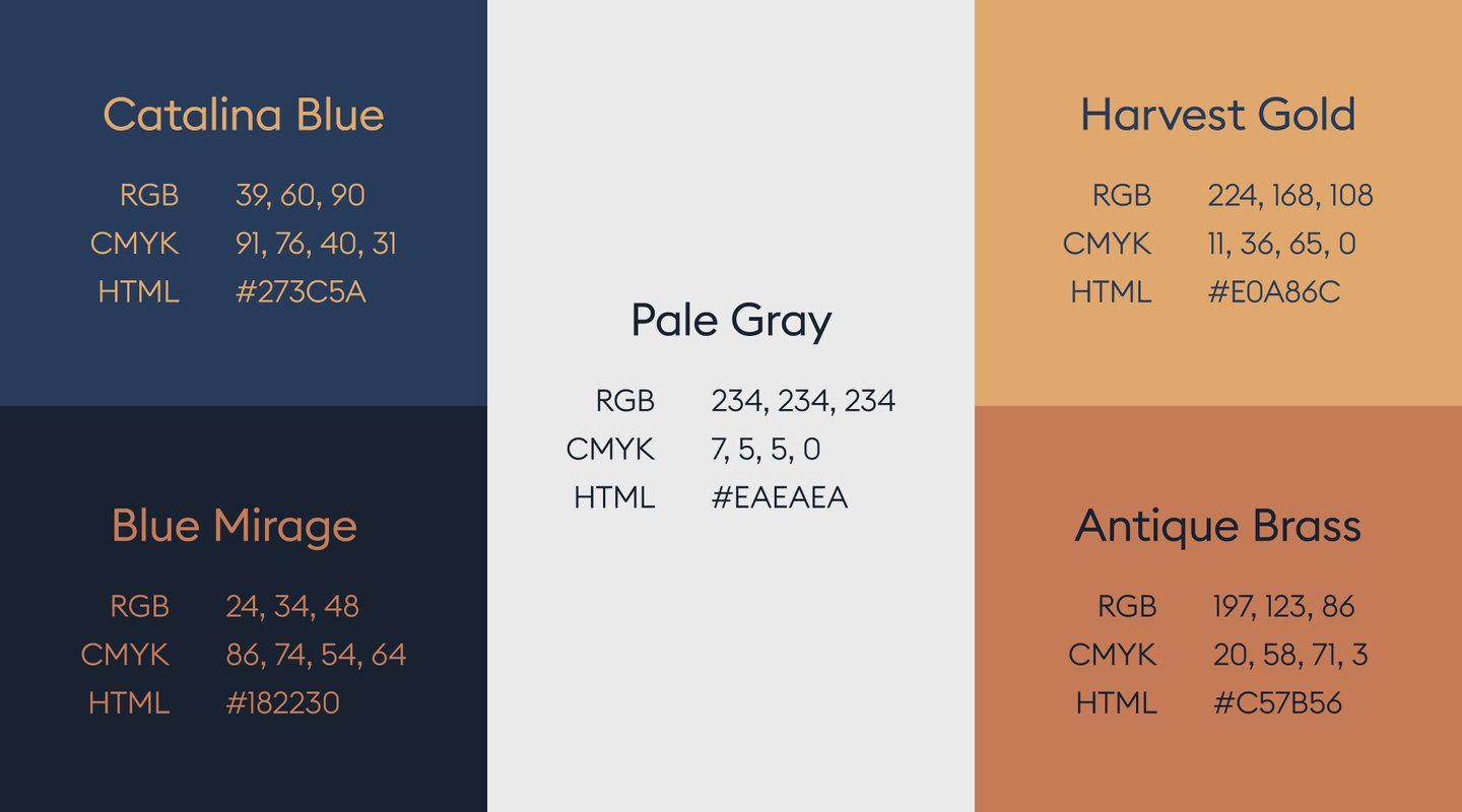
The main colors used were dark tones of Blue, Copper and Gold, with Pale Gray as the support color.
Blue is the color of trust and responsibility. It is a color widely used to also represent loyalty and honesty in addition to having a calming effect. In darker tones it is associated with expertise and stability and is widely used in corporate environments.
The use of gold is to convey victory, achievement and triumph. It was also used to provide a good contrast to the blue.
With a warmer tone, copper has a comfortable and homely feel that creates an idea of greater accessibility and realism. Because of its association with money, copper can also be an indicator of wealth.